
TruSens™ Air Purification App
Role: UI/UX Designer Launched: 2020
Overview
My Role
UX Designer + UI Designer
Method
Research, Concepting, Wireframing, Prototyping, Visual Design, & Usability Testing
Brand
TruSens™ is a wellness brand that focuses on air quality. The brand focuses on creating products that are proactive, science-based, contemporary and human-centered.
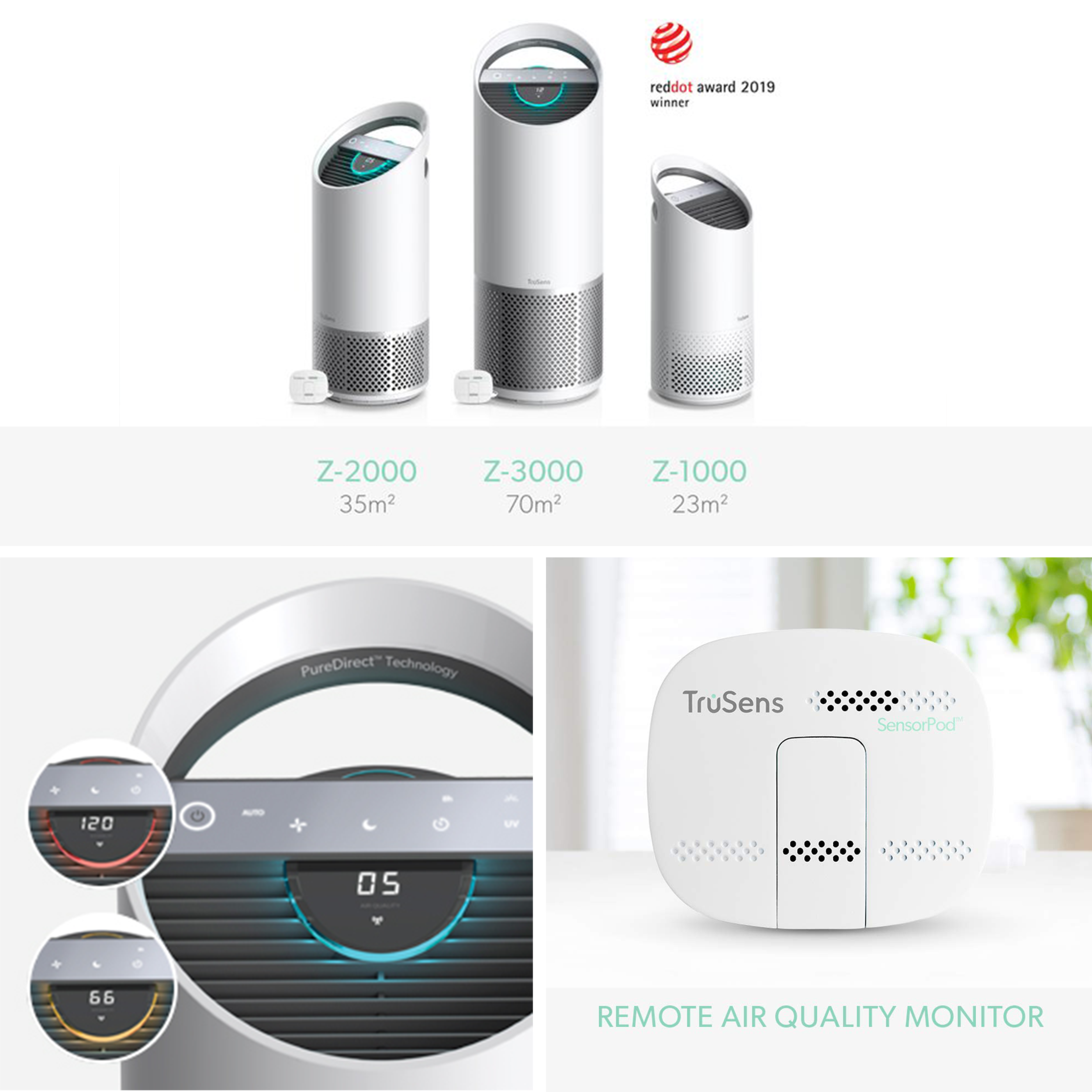
In 2019, TruSens™ launched three new air purifiers. To expand the product line and the user experience, the brand team identified a need for a connected mobile app.
Goal
Create a digital experience that provides additional data and control to the user.
The Challenge
As the sole designer, I was tasked to create a TruSens™ digital mobile experience that paired seamlessly with the next generation of TruSens™ smart air purifiers.
Brand Identity
Throughout the project, features were checked against TruSens’ brand tenants.
Understanding the Market
To gain awareness about the competitive landscape, completed research on competitor brands with paired mobile applications. This research assisted in benchmarking our own features and offerings.

User Interviews
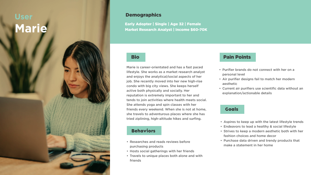
After initial meetings with the TruSens team, I learned about prior user interviews that were conducted for the first purifier launch and had a chance to review the user research. After analyzing the interview responses, some themes were identified and updated personas were created to guide the digital experience.
Theme 1 - My purifier should be ready & working during the right moments, especially when my family and I are home. I would like to be prepared and have consistent clean air.
“(My purifier) is in the kitchen next to the trash cans. Clean air is free of odor and allergens”
“I was born with chronic asthma, which is worse than most allergies. I can tell if I’ve left the unit off for a day”
“We have 3 pets, all of which I am allergic to, so (my purifier) keeps the air clean at night in my bedroom ”
Theme 2 - I don’t know anything about my air & would like to know the unit is working.
“I currently have a smart scale that tells me the quality of my air. Could my purifier do this?”
“I don’t know what these air quality numbers mean. Is there a way to better understand something like this. Seems very technical and unapproachable.”
“With clean air I feel energized, awake, well rested and better about not getting toxins in my body”

Problem Statement
Users already have busy lives and maintaining clean air assists them in completing their daily tasks with more ease. Currently users have a difficult time understanding, responding, and feeling comfortable with their air purifiers and home air quality.
How Might We…
Created “how might we…” statements from both the user interviews and personas. These questions assisted in conceptualization and understanding the user’s pain points throughout the project.
How might we eliminate the wait time for clean air?
How might we encourage proactivity with air?
How might we prevent bad air quality completely?
How might we give more control over their air?

How might we make tracking air quality fun?
How might we make understanding air quality the best part of their day?
How might we remove researching about air quality?
How might we educate users about the settings on the air purifier and how those can help clean their air faster?
How might we educate about specific tasks and their impact on air quality?

How might we provide air quality data to our users?
How might we remove thinking about air quality?
How might we make cleaning air at night the best part of a user’s day?
How might we make the worrying about their air less stressful?
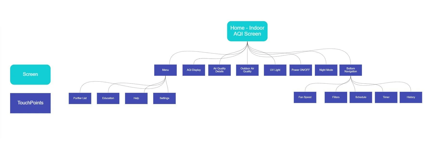
Information Architecture
Constructed the high-level app screen flow to understand what screens needed to be designed. Initial assumptions were to include 2-state buttons - ON/OFF- for quick access and the AQI display on the main screen and the multi-control buttons on the bottom navigation. The menu would include all informational content and high level list views of all the purifiers connected.
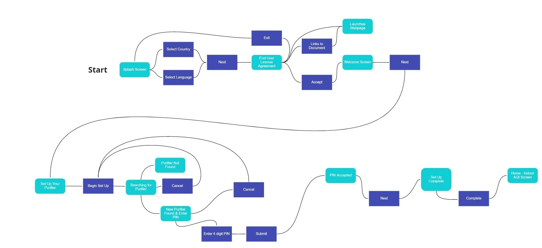
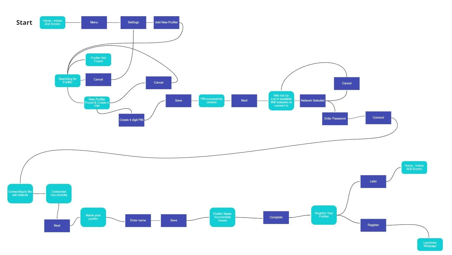
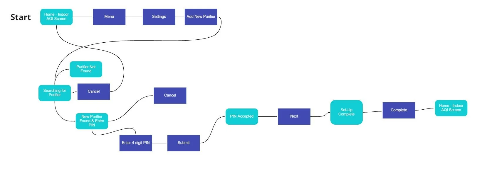
On Boarding - User Flows
Planning the onboarding experience was essential in distinguishing what screens we needed to create and the differences between the four scenarios identified. The four scenarios included: New App User + New Purifier, Existing App User + New Purifier, New App User + Existing Purifier, & Existing App User + Existing Purifier.
New App User + New Purifier
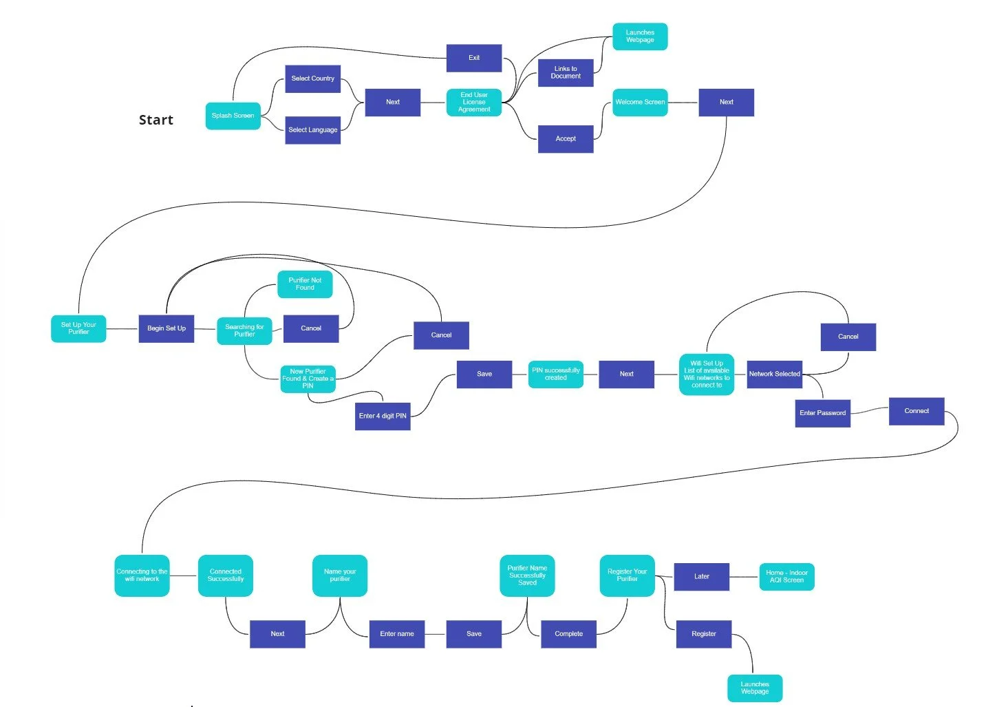
2. New App User + Existing Purifier (a user has set up a PIN and wifi for the unit already and this additional new user would like to connect to the same purifier)
3. Existing App User + New Purifier
4. Existing App User + Existing Purifier (a user has set up a PIN and wifi for the unit already and this additional user would like to connect to the same purifier)
Initial Ideation
Started brainstorming primary screen ideas based on existing user research, competitive analysis and brand information.

Indoor Air Quality Screen
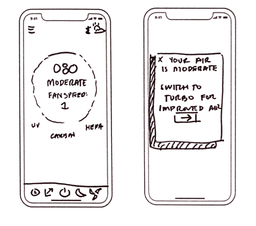
Initial assumption was to display filters on the main screen to ensure users are aware of when they need to replace them.
An additional assumption was to provide in-app notifications to encourage certain actions by the user. If the user suddenly has poor or moderate air quality and their unit is not in auto mode, the app would notify them to change to a different fan setting.
User Feedback
“I will mainly go to the filters if there is something wrong, so not sure how frequently I would use those buttons”
“The pop up is nice to have, but I usually just ignore them or “x” out. Too many pop ups. Maybe if I want to access that suggestion later, would there be a way?”

Filter Screens
Images of the filters and a visual radial filter life indicator coupled with a percentage was considered.
Swiping left and right to see each filter at a time with detail.
User Feedback
“Kind of annoying swiping left and right to see each filter at a time...might be easier to see all on one screen.”

Timer & Schedule
Both timer and schedule were housed within the clock section of the app to have a central area for time related tasks.
Also, multiple scheduling times were considered to offer flexibility with multiple units and times.
User Feedback
“Too much..its just an air purifier, so probably would not have multiple times scheduled per purifier.”
Medium Fidelity Artwork
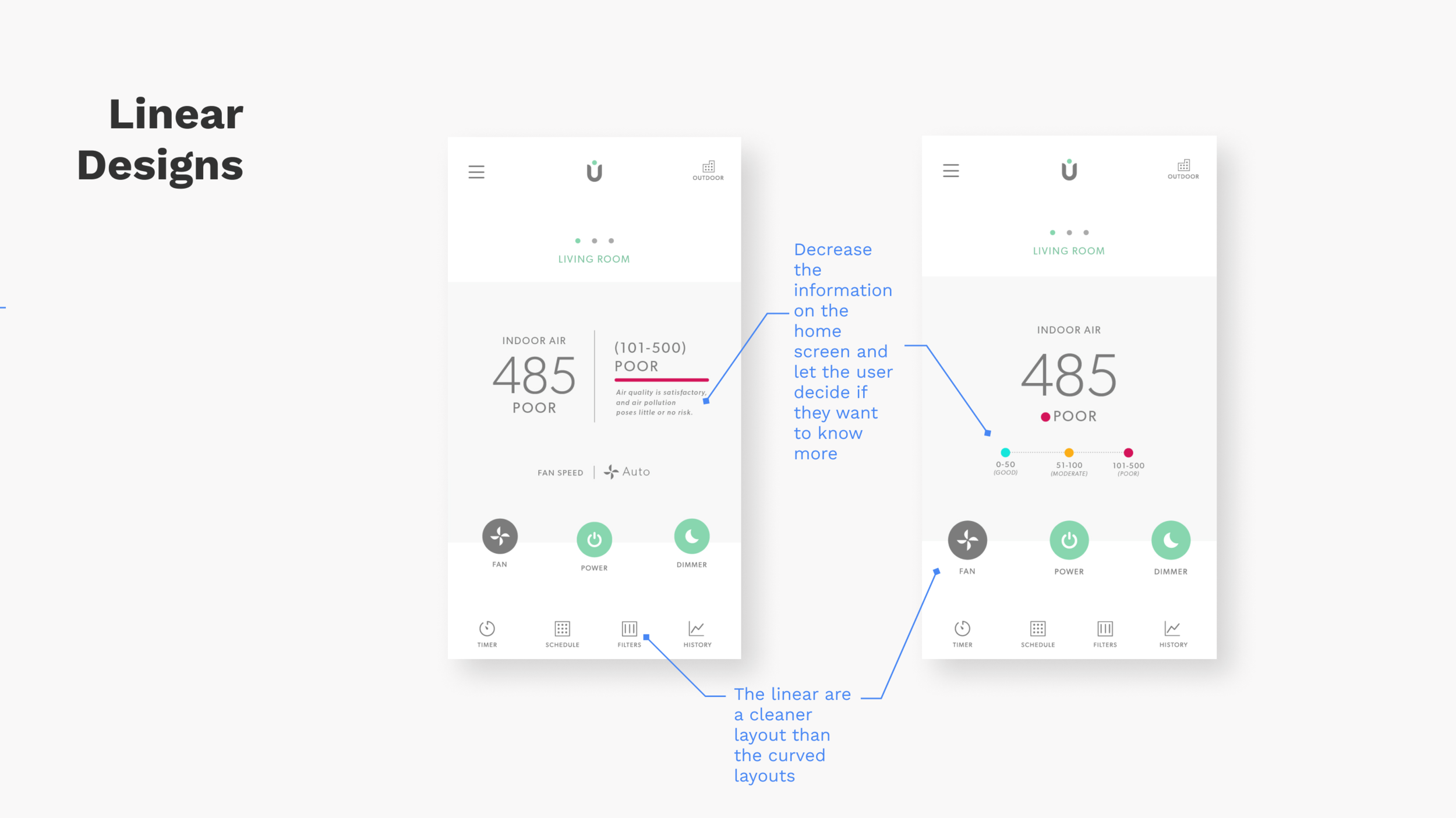
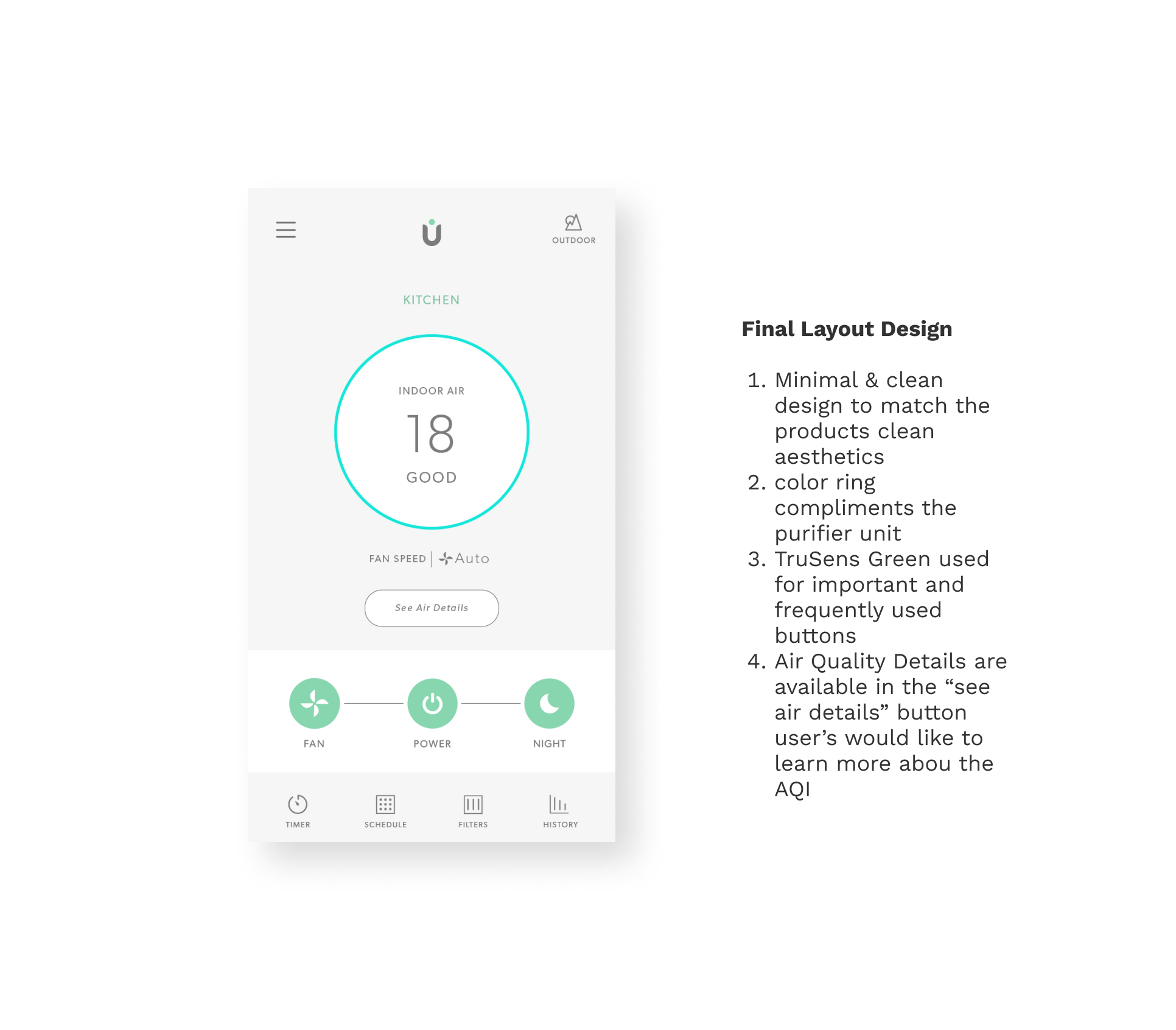
Based on the information architecture exercise, designed medium fidelity screens to start evaluating layout and placement. Tested these designs with my cross functional team and decided to rearrange the button arrangement slightly to eliminate the option to adjust the UV light. The reasoning was to eliminate complexity and to highlight the most frequently used buttons (fan speed, power button, and night mode) on the current purifier unit.

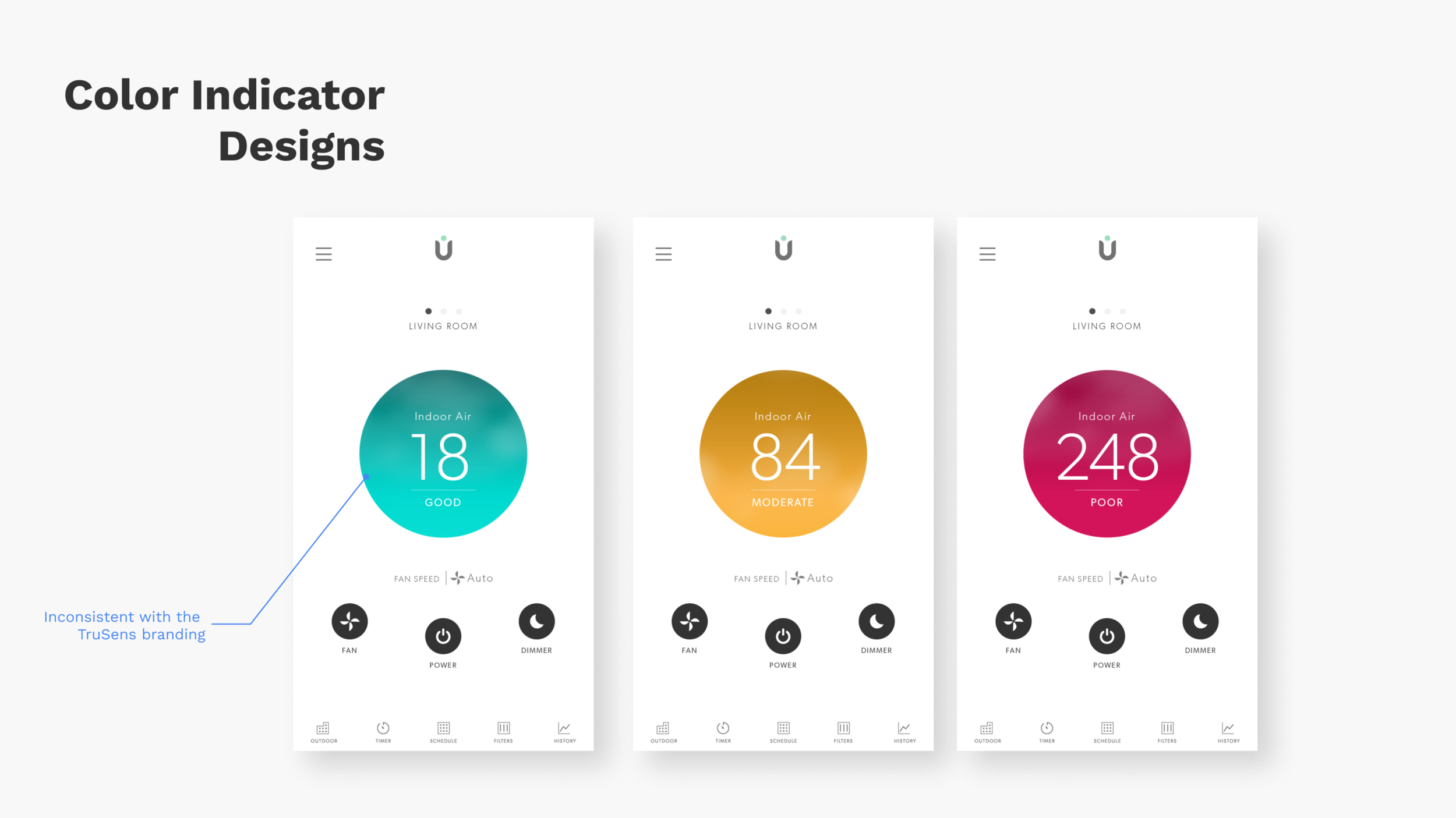
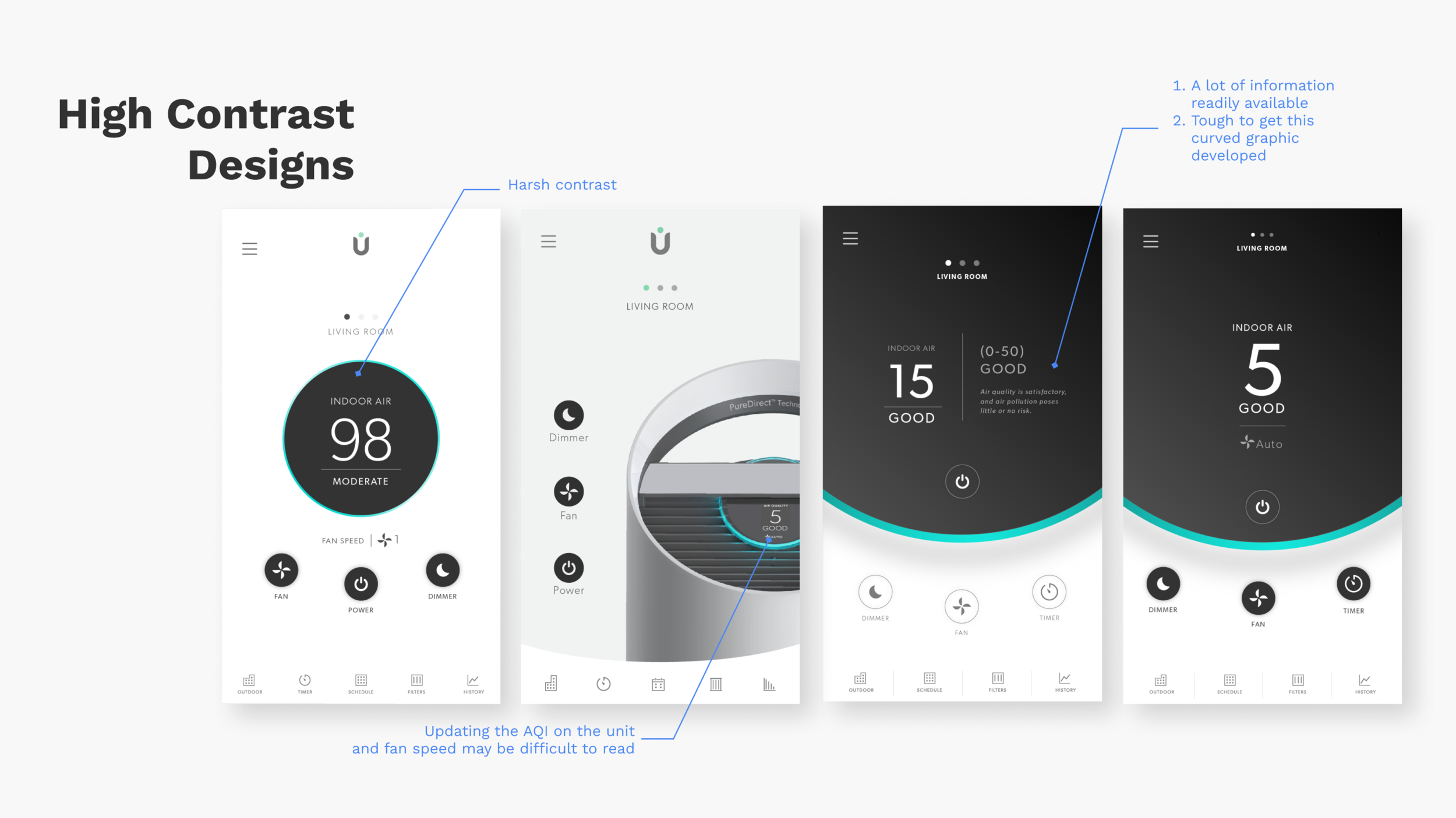
User Interface Exploration
Reviewed User Interface options with users and key stakeholders. I received feedback that assisted in creating the final design direction.

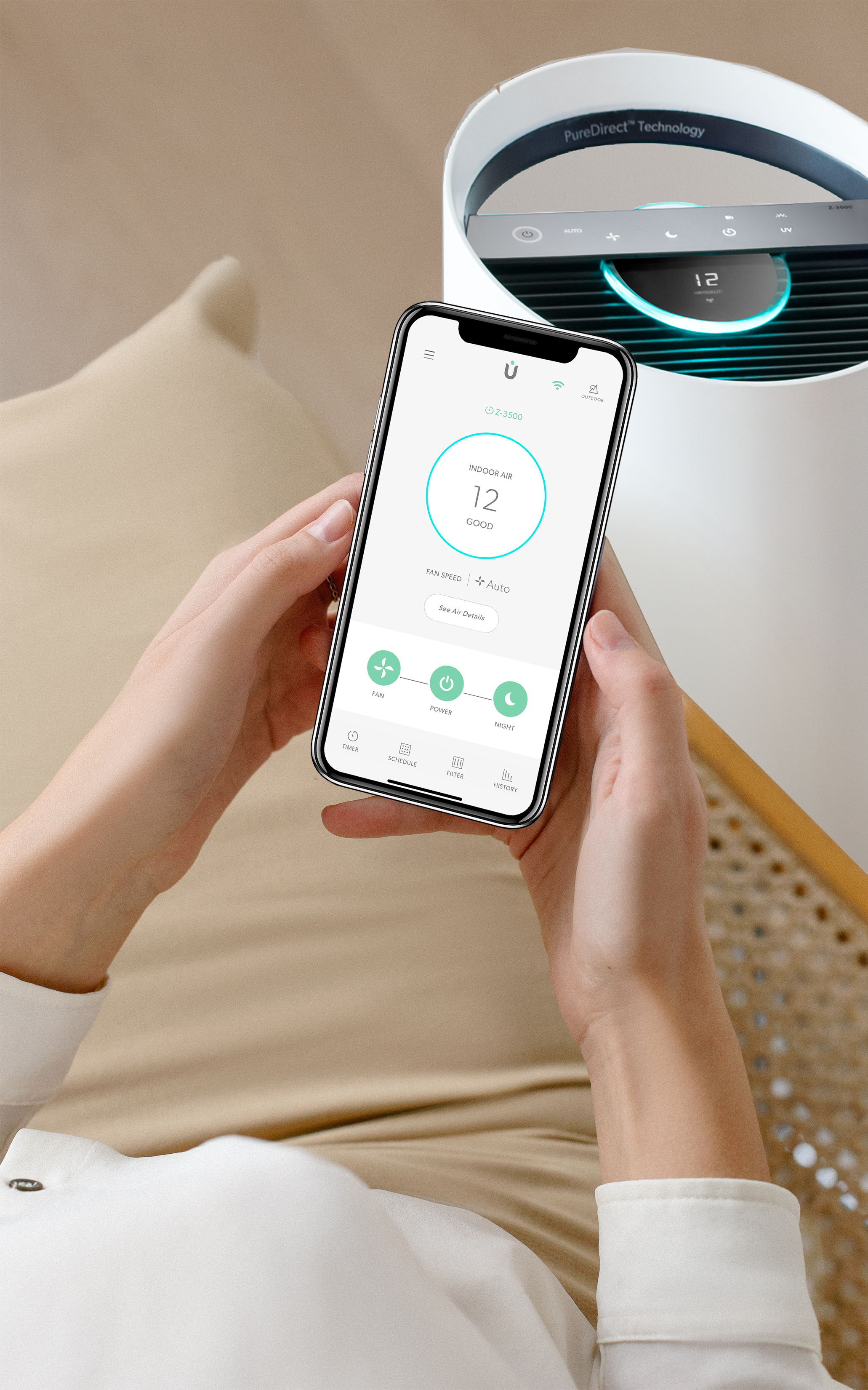
Final Solution
Launched in the App Store in 2019
Received a Good Design Award under the Mobile Application Category
On-Boarding
Main Controls
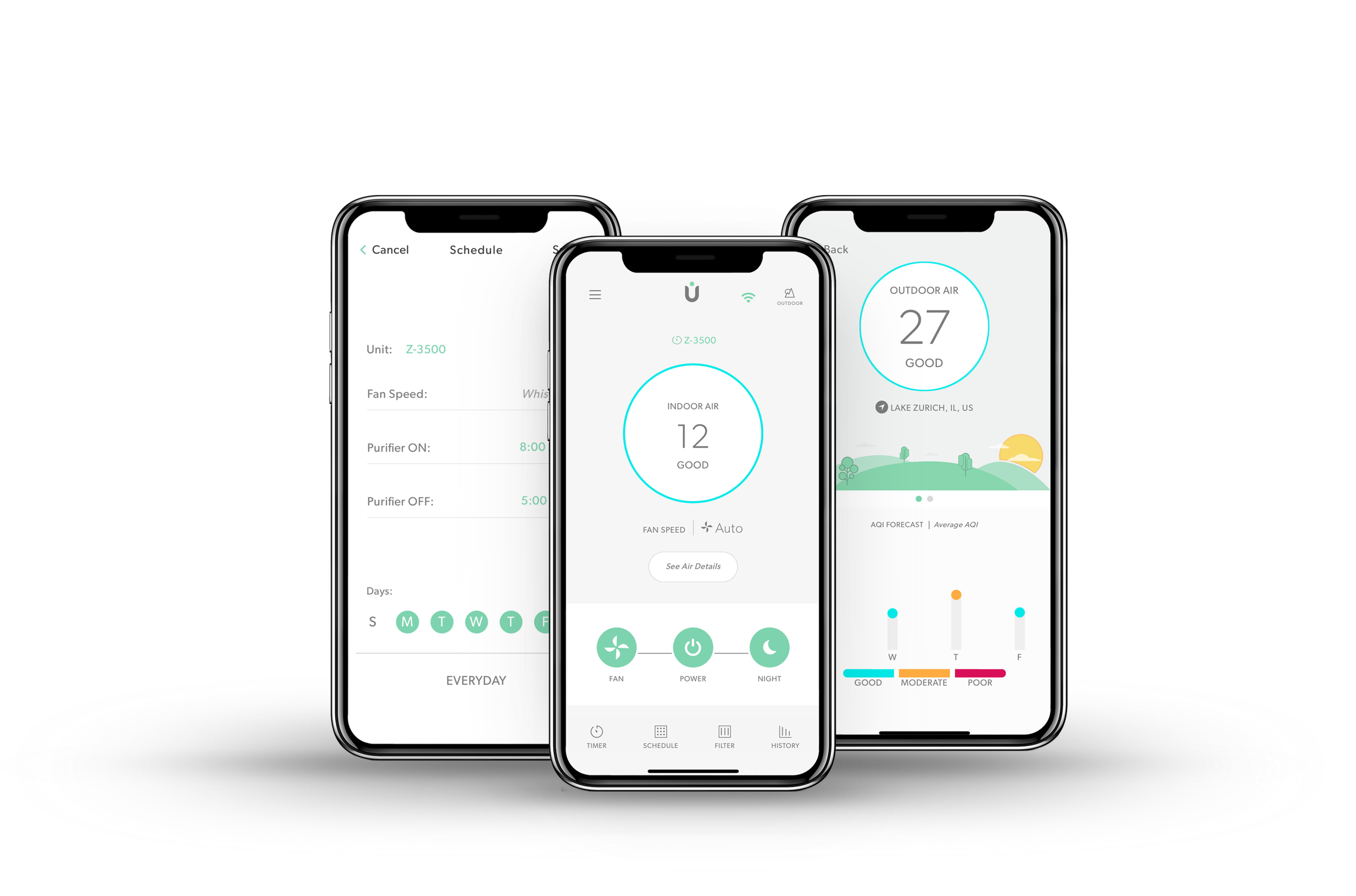
Filters, Scheduling, Menu, & Outdoor Air Quality
Wireframes and Handoff
On Boarding - New User + New Purifier
Main Controls & Home Screen
Menu
Historical AQI Data
Indoor AQI Details
Outdoor AQI Data
Reflection
As the sole ux designer and ui designer on the project, it was a rewarding challenge in designing the TruSens Mobile Application. I was able to collaborate and greatly learn from my cross-functional teammates and users. I was involved in all aspects of the product process from marketing to development discussions. As a result, I was able to see an idea transform to a full product launch.
For next steps, I would like to continue conducting user testing with the current version of the app to understand ways to improve the user experience. Some areas I would like to further test include the outdoor air quality, history and schedule features.